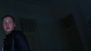
Entry 14 - New Storyboard
I reshot all scenes except the investigator scene, keeping Mr Andrews recommendations in mind. I felt bad that my group also got dissed for what I did, so I worked harder this time.
1. I has to reshoot this shot several times because I kept on forgetting some sort of rule. At first I tried shooting it up close so it showed the characters distressed emotion. However, that didn't really give my face good lighting, because the light source was behind me. I was also facing the place with lots of frame space and didn't even apply the rule of third.
I then did it again with my face on the rule of third this time and half the light covering my face as the light source was next to me. However, the shot was kind of still too bright for the heavy atmosphere of this scene.
I then faced the left side with less frame space and lowered the exposure. I kind of liked this shot, but not really.
Finally, I asked my mum to shoot me from high up so that I could have a high to low angle shot. This would create a pressured atmosphere for me. This shot worked perfectly. The light lit my face just right as half my face was covered with harsh shadows to show my distressed and weak emotions. My surrounding was also dark, thus creating a heavy atmosphere.
2. Learning from my past mistakes, I reshot this one using a low to high angle shot and then making the place that the femme fatale is facing to have lots of space. The lighting is also lighting the femme fatale from bottom up and half litting her face with a soft edge, showing that she's evil in secret. I also lowered the exposure in this shot to create that heavy atmosphere.
3. This shot was really hard. I couldn't get the shadow right no matter what I did. At first I tried a long close up shot to clearly show that the husband is dead and to make the shadow big, however, the shot didn't create a big impact. The knife was also kind of dull and meh in general.
I then tried tricking the audience that my shadow was the dead husband's shadow, but that didn't work out as well. Furthermore, this time I didn't add the knife in the shot to make the shot more mysterious by only showing the murderer and the weapon through the shadow.
Finally, I just brought the shot into a close up shot instead of a long shot. For the shadow to be big on the wall, I had to bring the light source low and to make it shine up (low to high angle). It took us a while to figure that out. I also wanted the knife to shine from the light to create more impact for the knife.
4. For this shot, Mr Andrews recommended for the shadows to be long and hard. Therefore, I shined the light from behind me and then had my sister take photos in front of my face. She did lots of quick shots while I moved my hand to see what position the hand would look best in this shot. We also lowered the exposure for this shot.
5. This shot, I love. The shadow is big and long on the wall and my face is dully lit, creating that idea of me being weak. My surrounding is dark so it makes it seem as if the situation is bad and forced. My facial expression is clearly shot. I'm shot from a high to low angle clearly making me seem vulnerable. I'm also on the line of third :)))) The hand that's reaching out to me seems powerful because it's as big as my head.
6. The shot where the femme fatale is about to whack Jack in the head is alright. I couldn't get the lighting right, so this was the best I could get out. It's low to high because it's a POV shot from Jack and she's kind of in the line of third. The shadow on the back wall is big, which is nice because that's supposed to show that she's evil. It's a meh shot tbh.
(P.S I had to send screenshots of the storyboard to my group members because the file was too big ;/)


Comments
Post a Comment